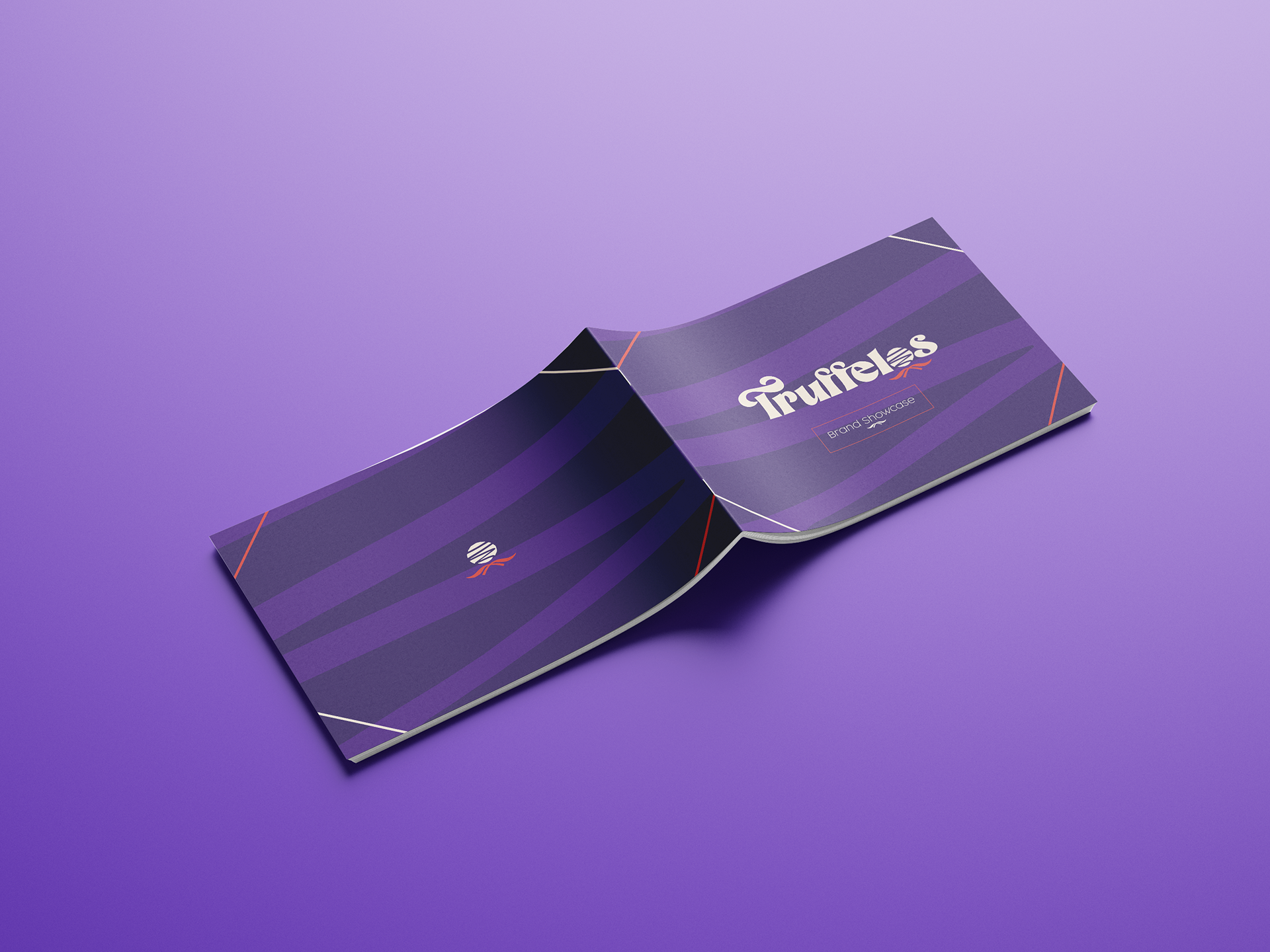
After seeing that their old brand identity didn't reflect the high quality products, I decided to give Aberdonian chocolate shop 'Truffelos' a makeover, and they were more than happy to let me!
As this was a live client project, there were more challenges that I overcame than what normally comes from university projects. We had meetings, discussions back and forth, and a long creative process which eventually ended with a very happy client. As of now, I am due to meet with them again to begin implementing their new identity.
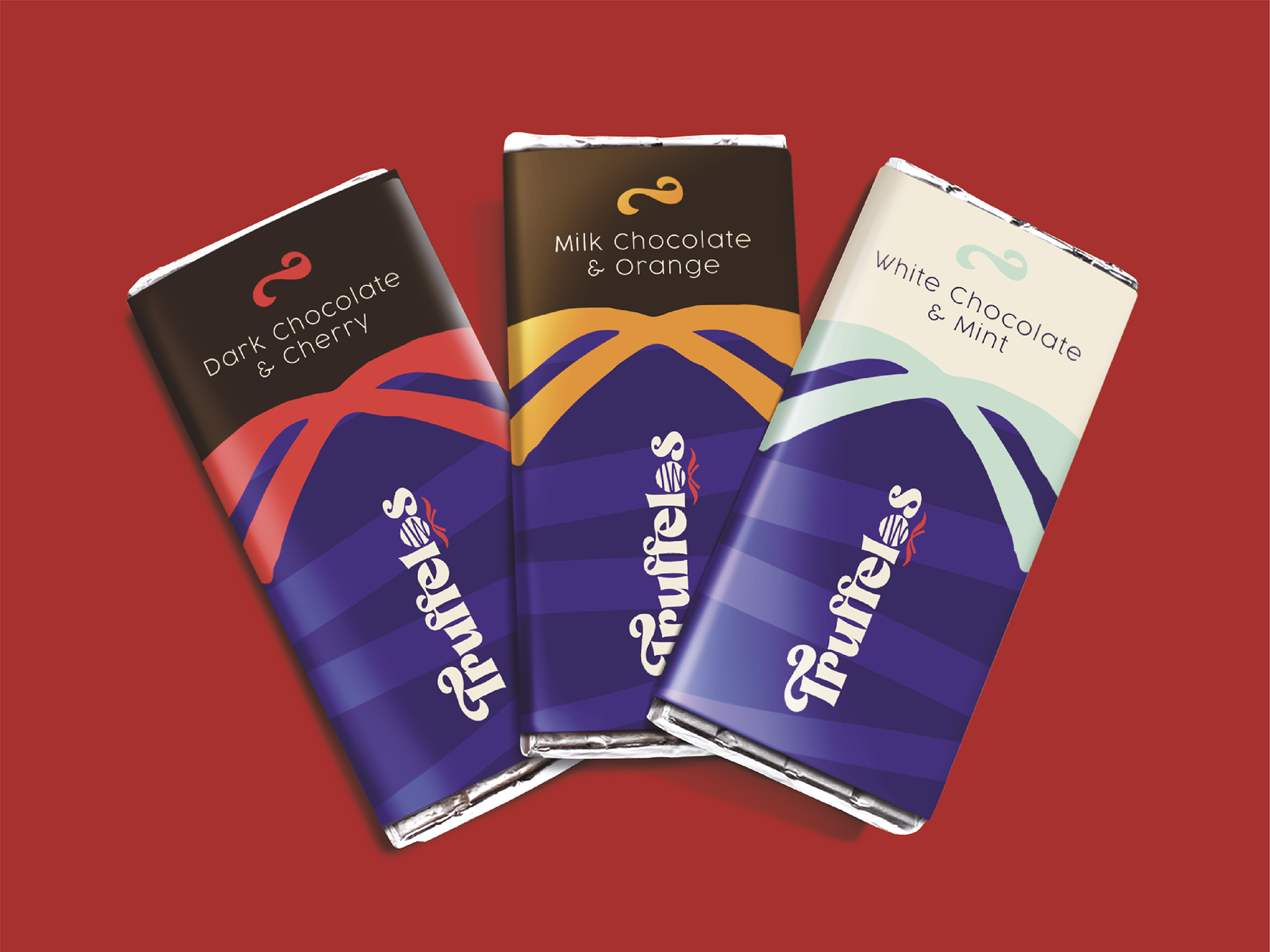
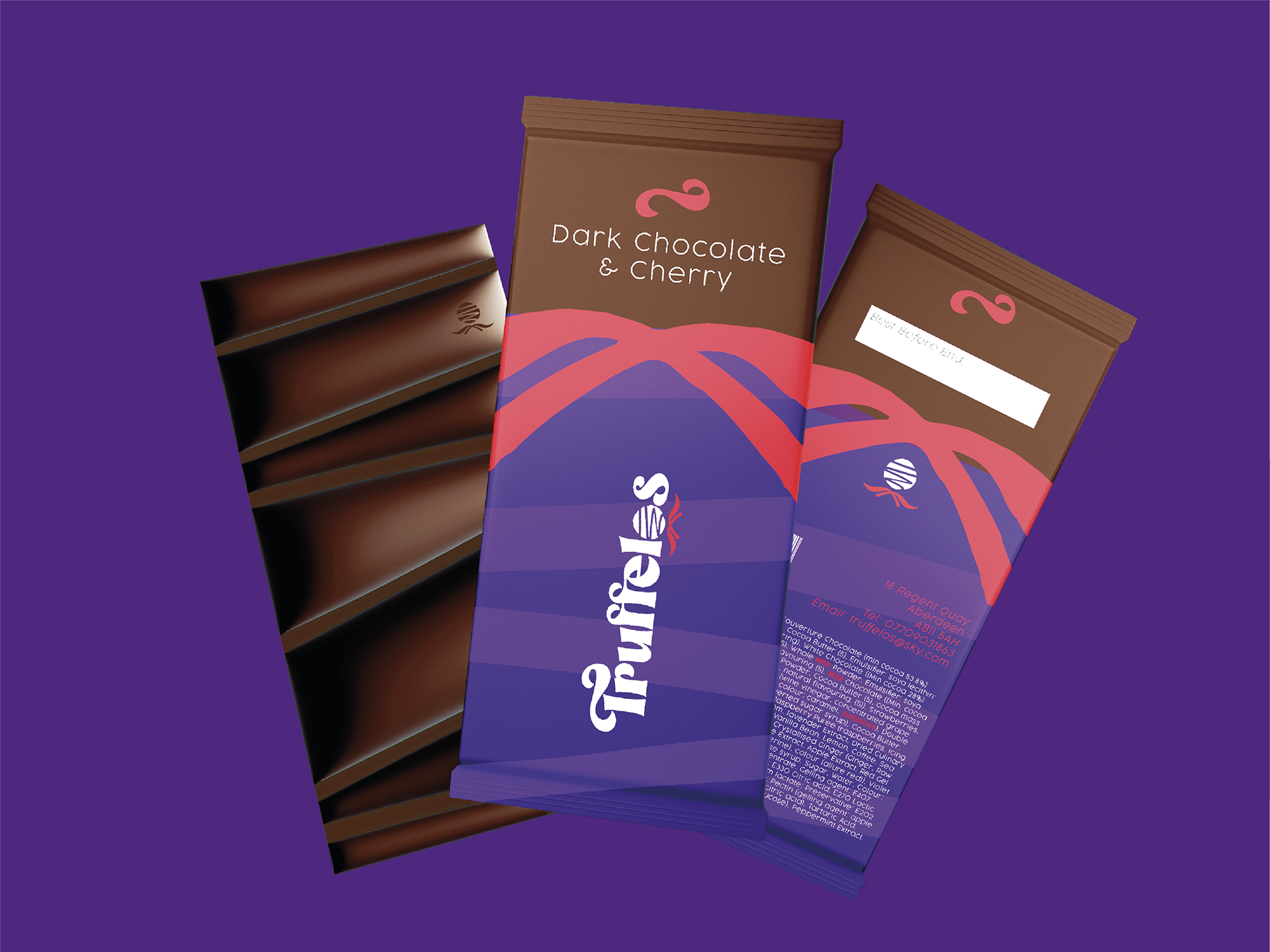
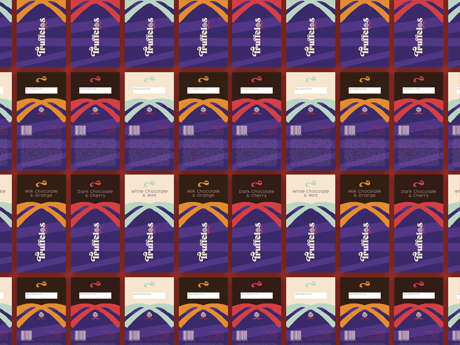
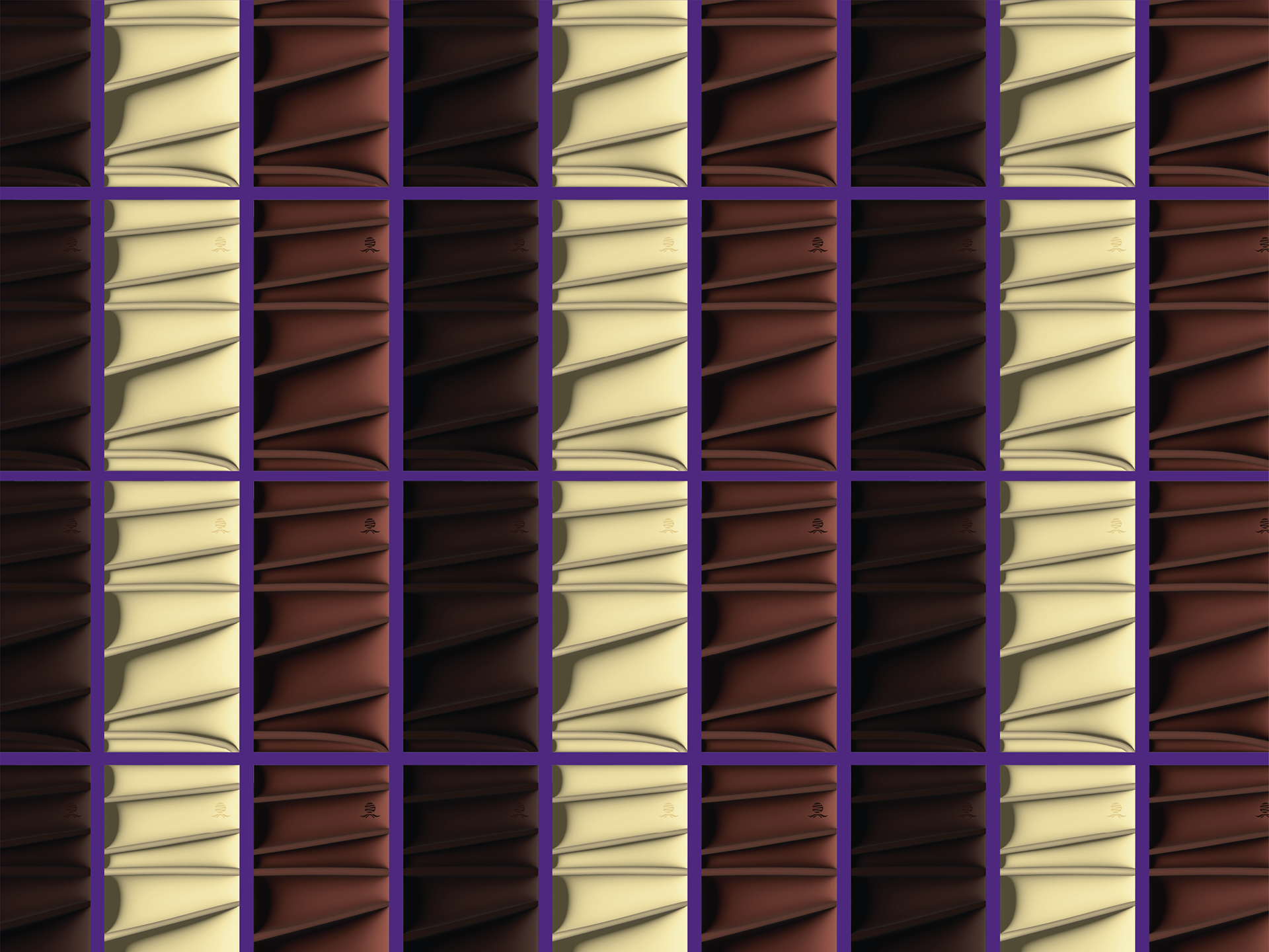
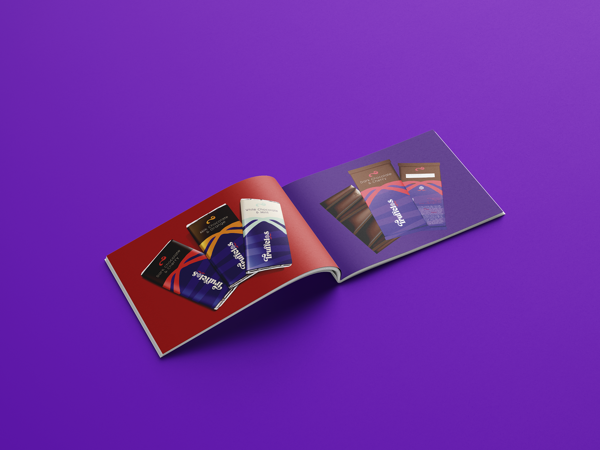
Their new chocolate bars represent the fun and creative nature of the business, with the chocolate its self reflecting that of the printed visuals, all wrapped up in colourful bows which represent the flavour!
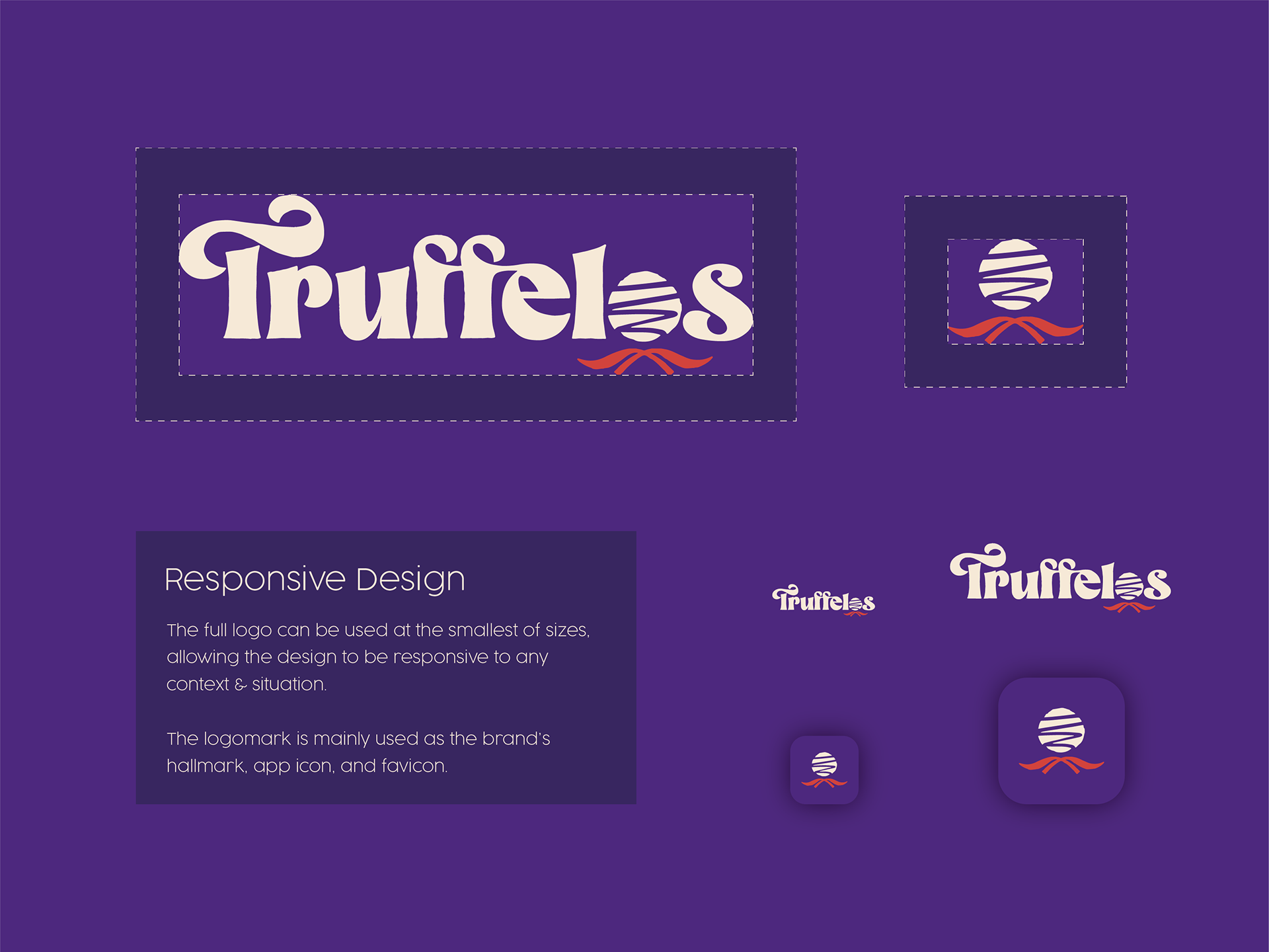
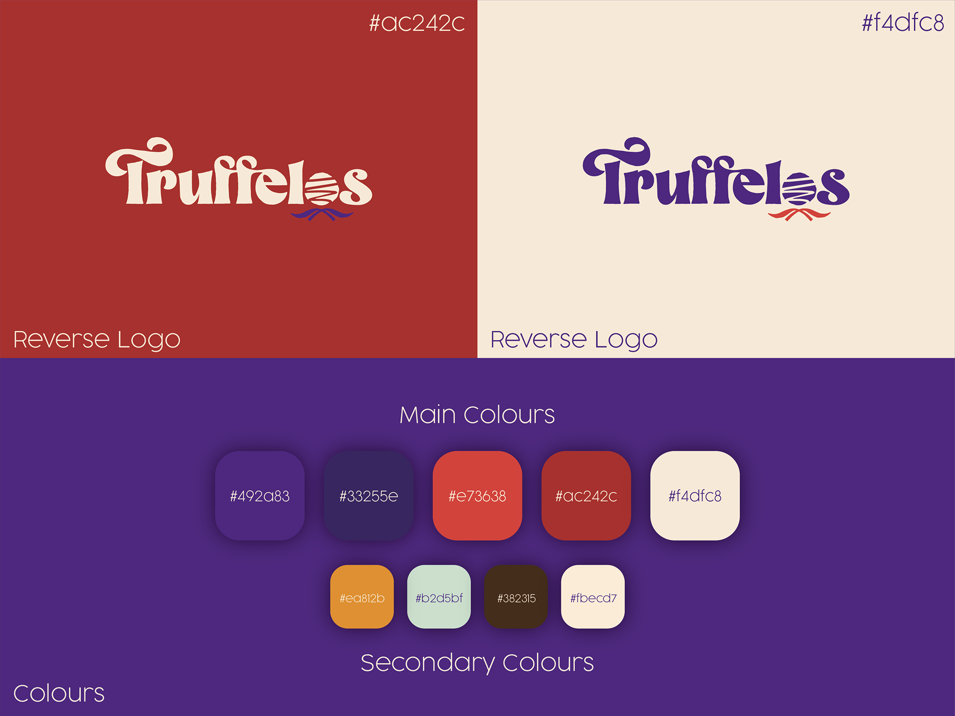
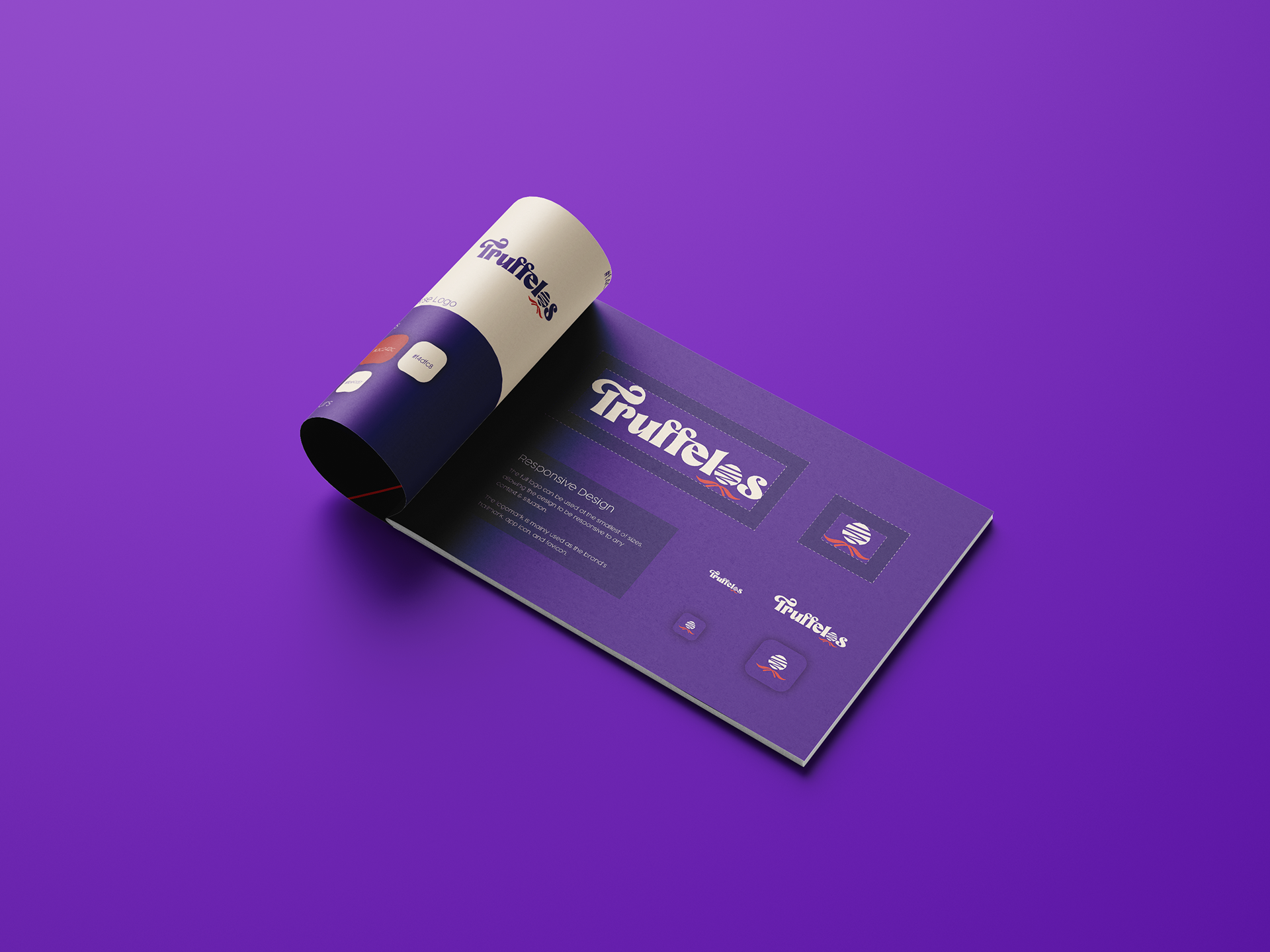
Shown above is the new responsive logo design and colour scheme. Fun, and fabulous!
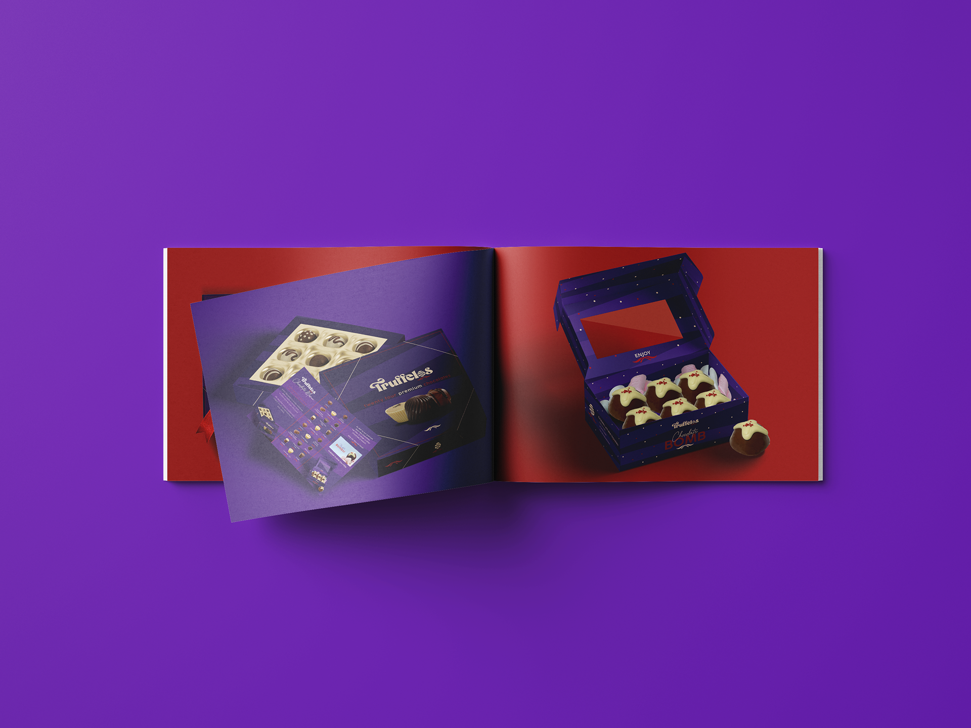
Below is one of the staples to the company's success, their delicious chocolate bombs! The new packaging features an explosive polkadot style, unique to this product and selecting the top of the chocolate bombs.
Here is a brand showcase video, created to show off the assets to the client in a more fun and exciting way than still imagery. I wanted to show off their new logo animation and style to get the fun yet classy nature across.
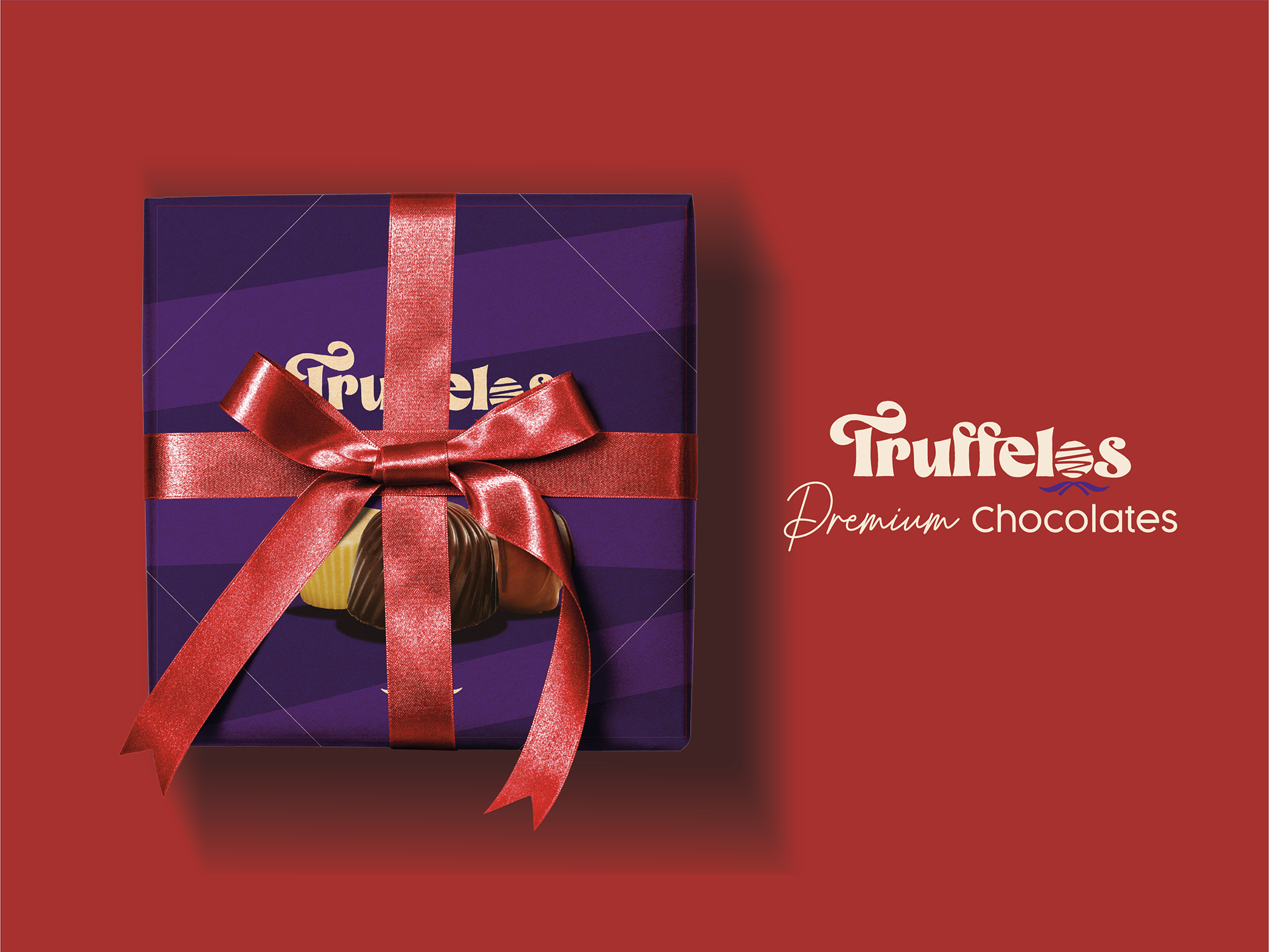
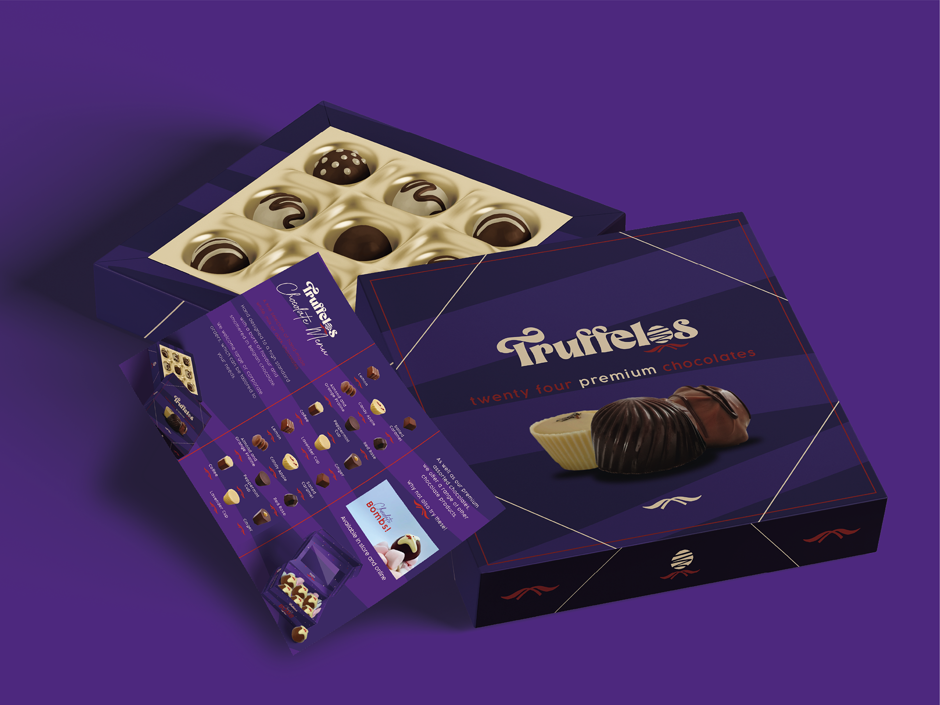
Truffelos can't be Truffelos without Truffles! Their premium chocolate boxes are packed with fun and tasty luxury chocolates, wrapped up in a bow.
The Bow element is used throughout the physical and printed assets of the brand identity. Typography and prints feature the bow which is used to emphasise areas of the brand, whilst it is also used as a way to tie the boxes together in a neat way. Luxurious.
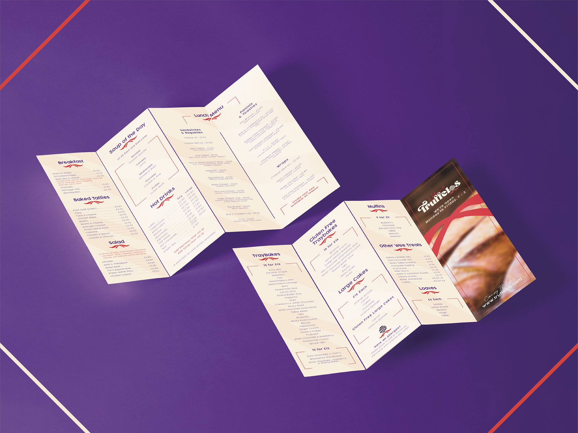
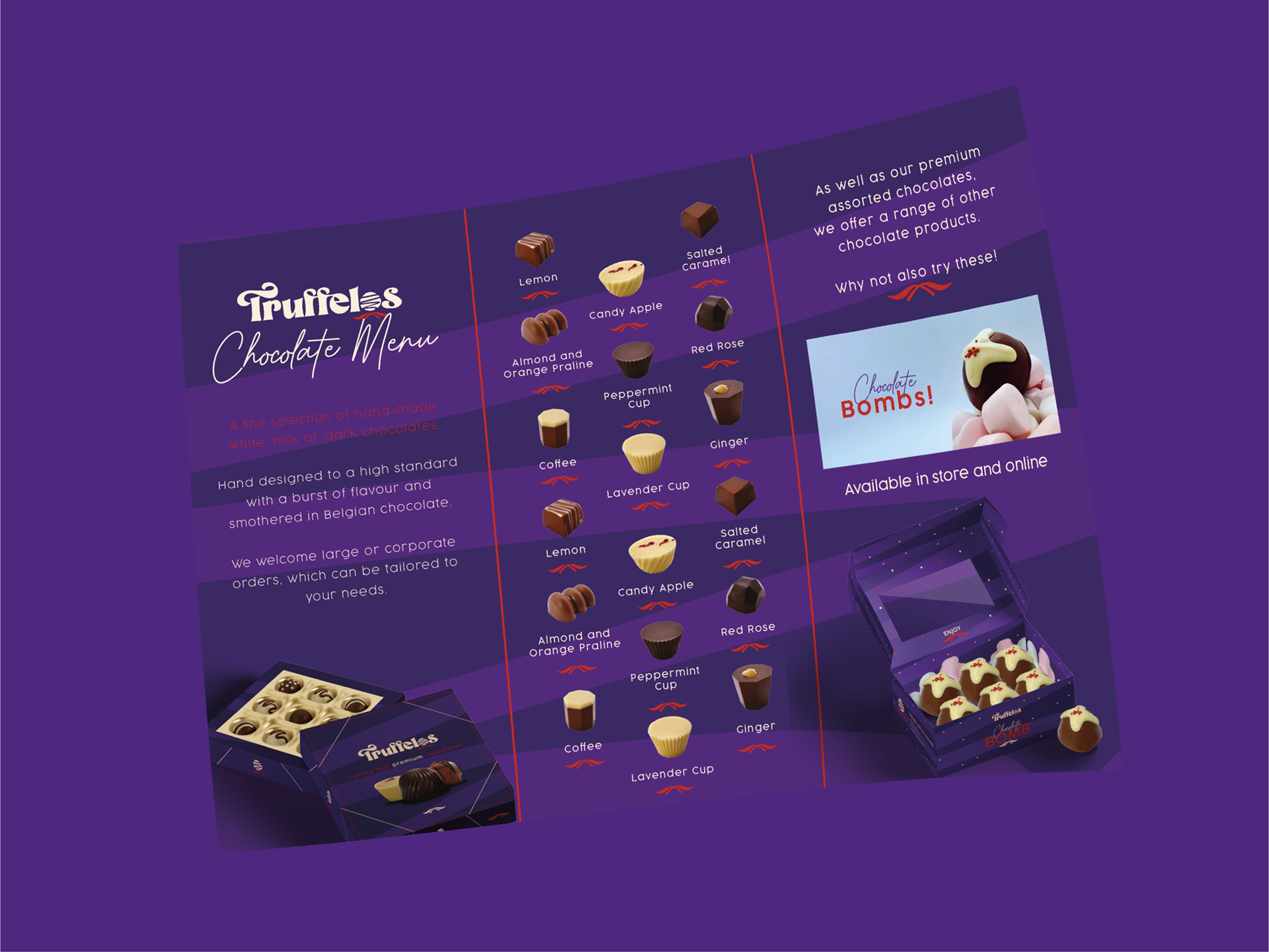
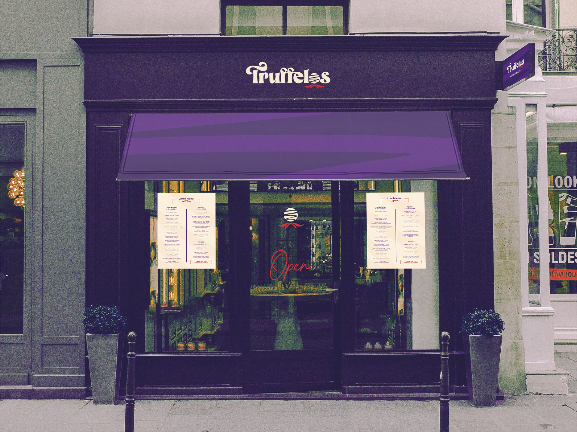
The menu is the gateway into the product line, the first step in creating a mouth-watering sensation. Whilst the chocolate menu is fun and simple, Truffelos also sell bakery and deli products and required a quad fold menu as a point of sale for these. They are now easier to read and flow with an easy to understand tone.
Behold! The shop! Shown above is a mocked up section of the inside of Truffelos, featuring the menu on the TV and brand identity spaced generously upon the walls. Takeaway pamphlets and menus are on display stands, all whilst the light coloured wooden floor and spokes separates the deep purple walls.
The website should be as exciting as the shop - it is the first impression to many potential customers. The site design is colourful, featuring swirls and textures wrapped up in a bow. Imagery of the products are places within shapes, showing the luxurious products within a fun setting.
