Based on the architectural styles of Aberdeen, Toonser is a blend of brutalist & gothic styles, bringing elements of bold modern sans serifs and gothic typefaces together. I felt the city had no typographical identity, but its architecture showed a unique tone in the fact of having an extreme mix of the mentioned styles.
The lowercase features spires which reflect that of the city, whilst the uppercase shows much of the brutalism within newer architecture. The version of the typeface on show is a regular style, and as a personal project, I plan to take it forward after my studies.
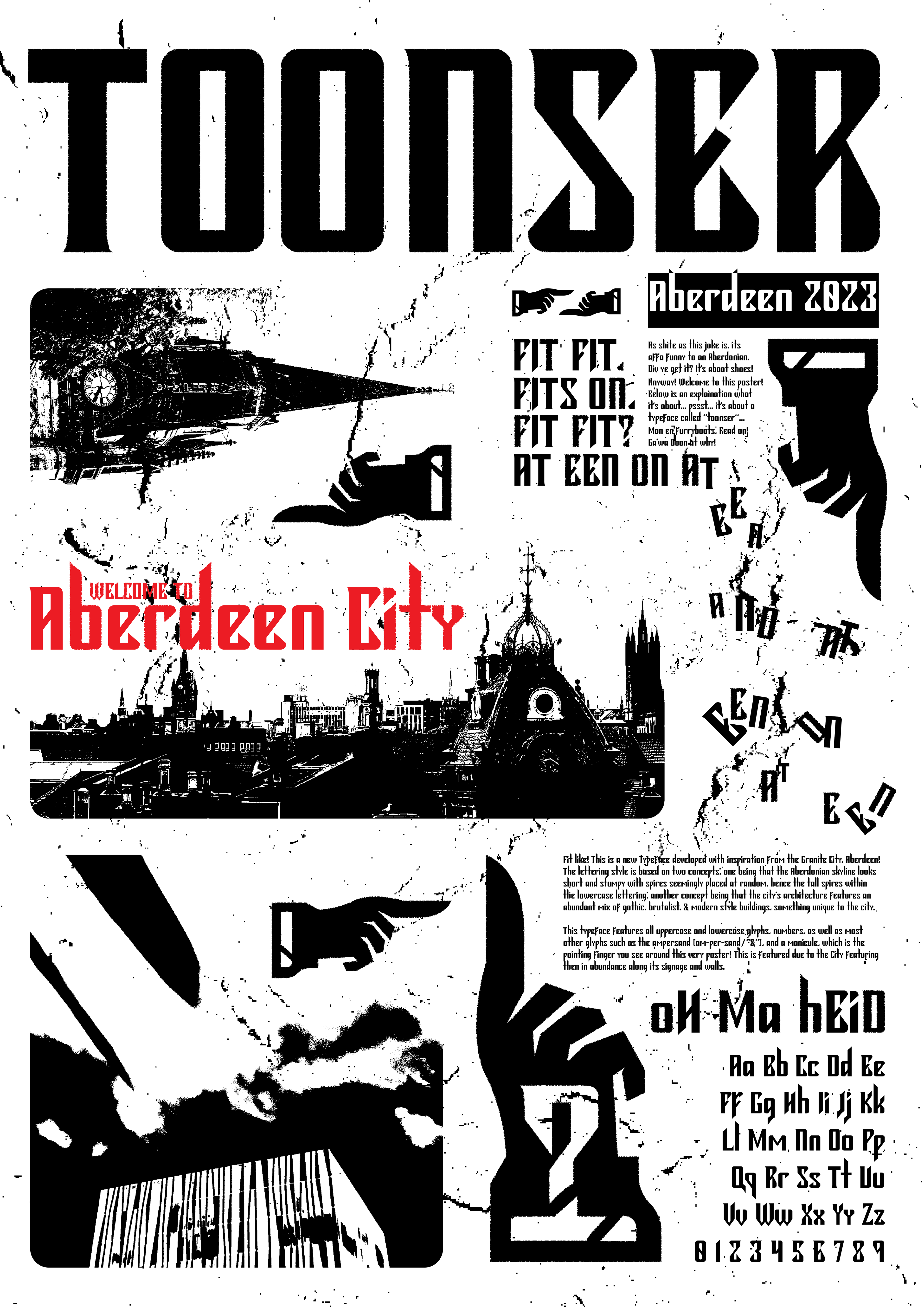
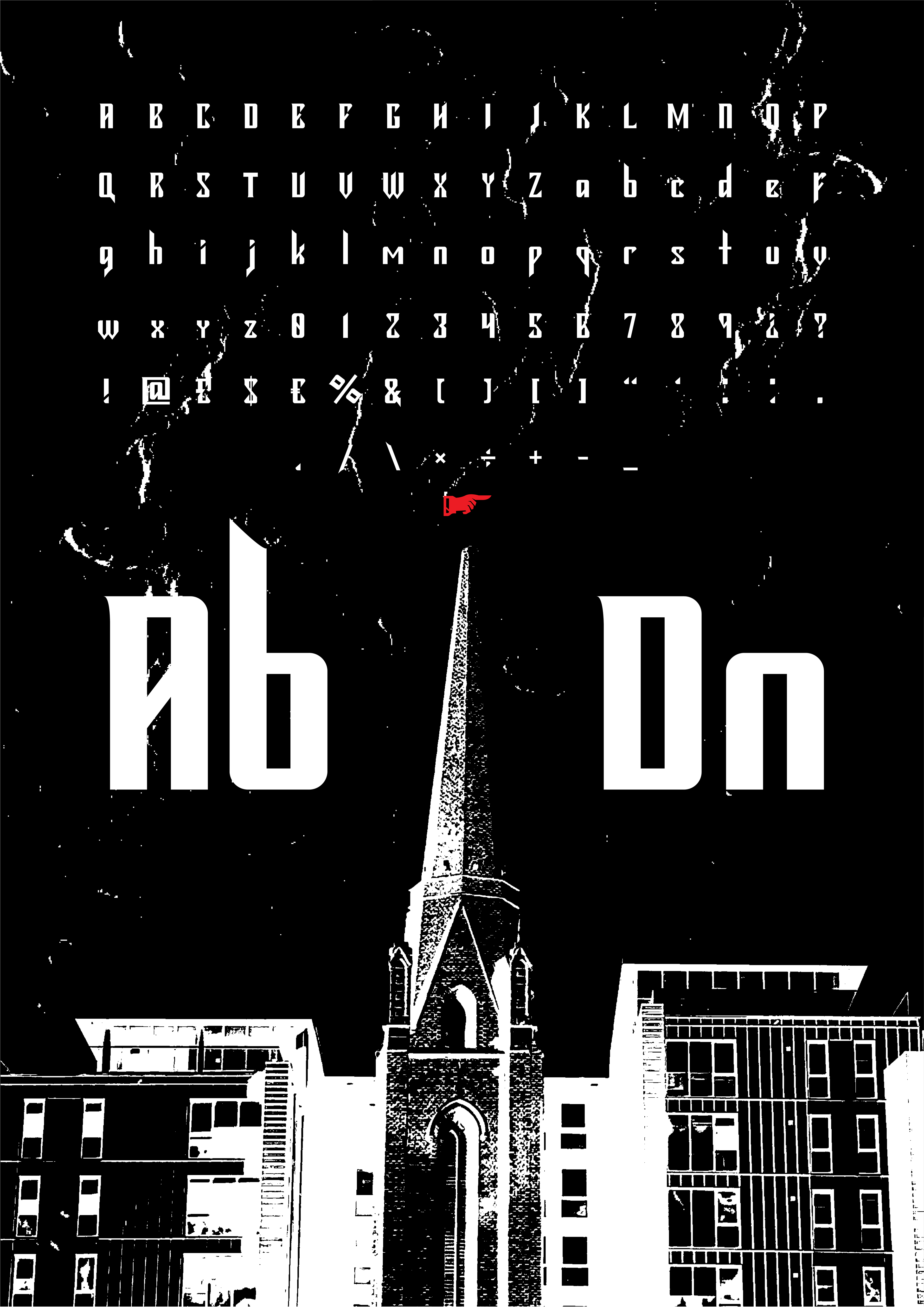
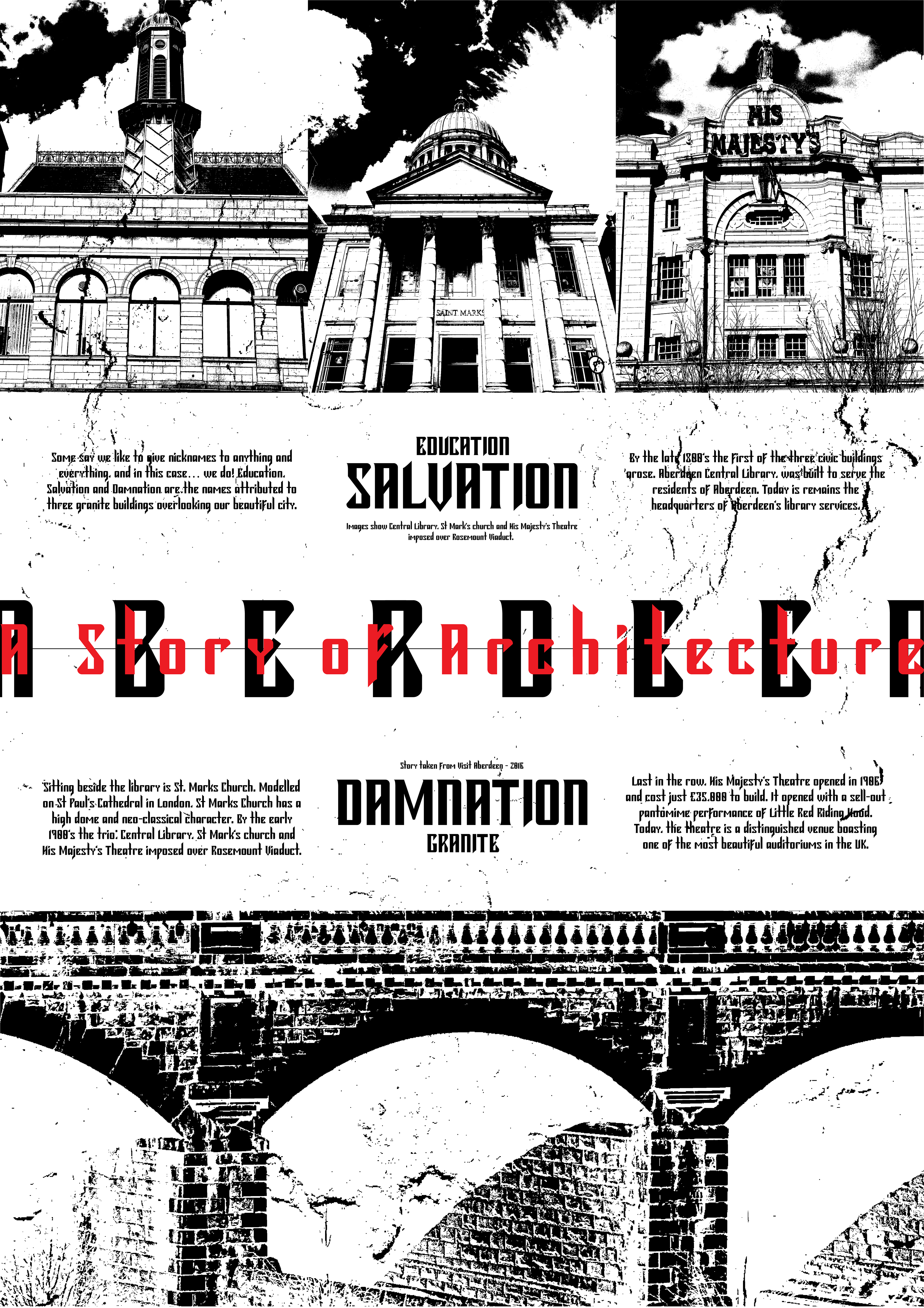
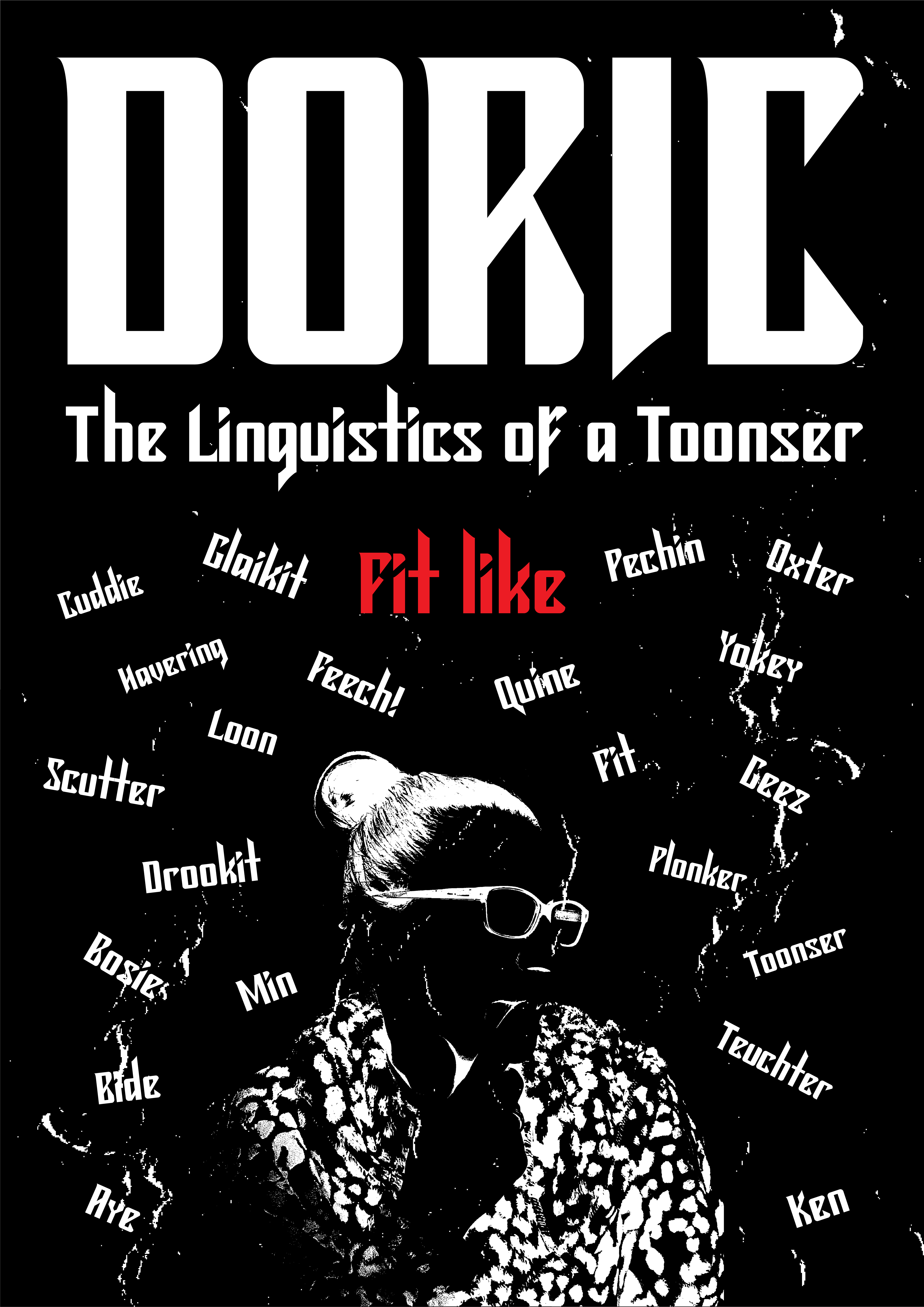
The above posters feature my typeface, as well as imagery that I feel represents the city well; the architecture, the people, and the history. Each poster was rispgraph printed for my physical final outcomes.
The video shown here is a showcase of my font and the city of inspiration. The architecture that were direct inspirations to me are shown, all displayed in a brutalist set somewhat gothic style.
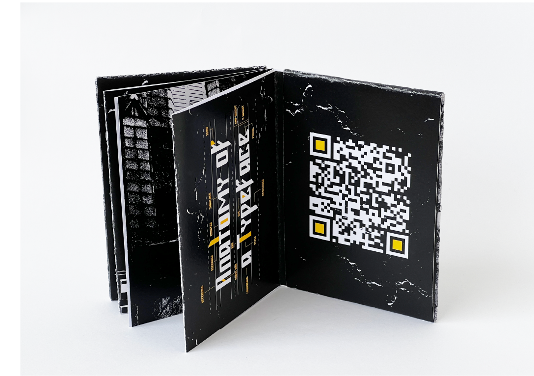
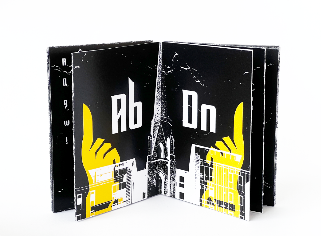
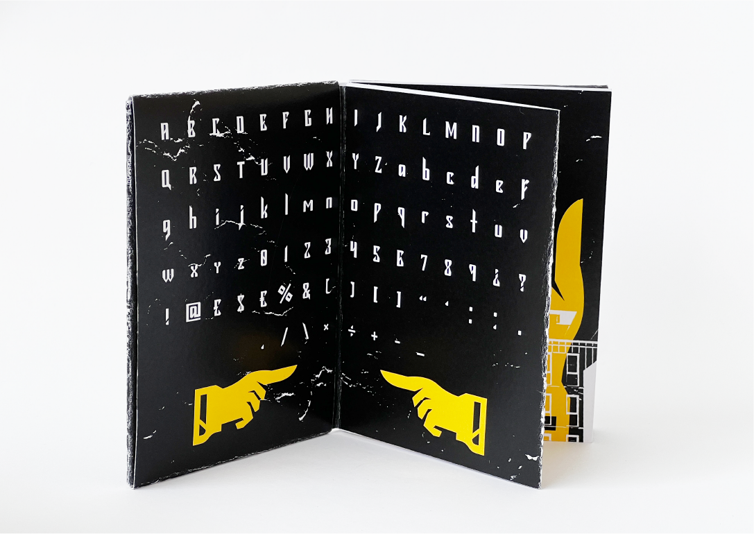
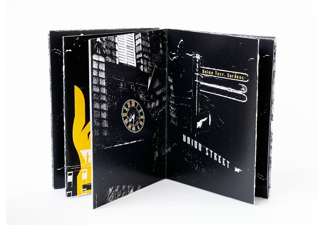
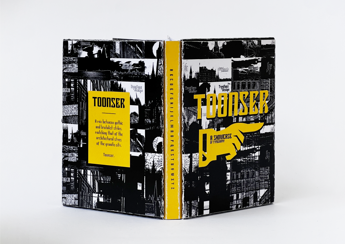
A typographical booklet, created concertina style showcasing the font up close, the 'anatomy of a typeface', architectural imagery and manicules splattered throughout!
In 2023, I thought I'd take part in the '36 Days of Type' Instagram challenge! The idea is that for 36 consecutive days, you upload an image or show video of a bespoke letter. I showcased my uppercase glyphs and my numbers, eventually creating a cool checkerboard style animation. The letters animate in with an inky style, bleeding into their surroundings as if it were on granite.
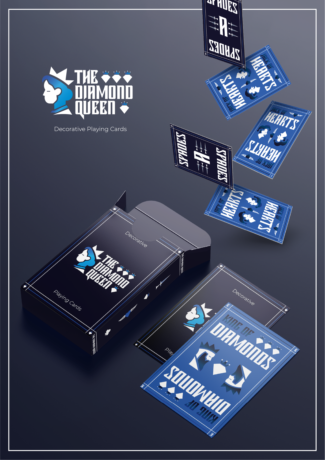
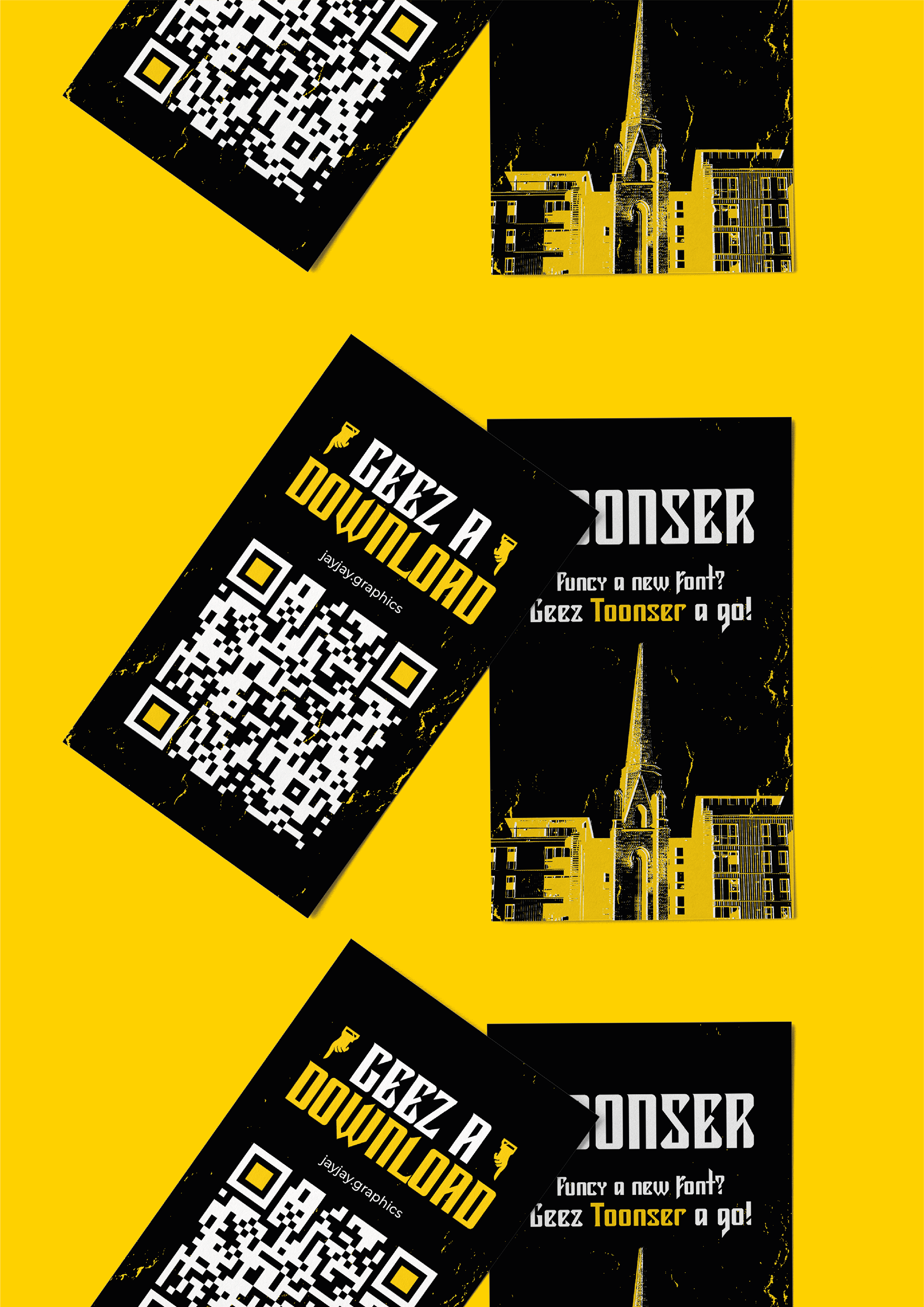
Physical elements can make projects stand out more, so I wanted to create some playing cards, based on a fictional brand using my typeface, as well as some download cards that I can had to people at the degree show!
